Blum & Poe Broadcasts presents free and public access to scholarship and writerly ponderings from our publications archives.
In focus this week—an excerpt from curator Joan Kee's From All Sides: Tansaekhwa On Abstraction (Los Angeles: Blum & Poe, 2015), on the Korean monocromatic painting movement known as Dansaekhwa, and its first major overview in North America.
Broadcasts features a roundtable discussion titled On Color in Contemporary Painting, between artists Park Seobo, Shim Moon-seup, Takamatsu Jirō, Suga Kishio, Hikosaka Naoyoshi, and Lee Ufan.
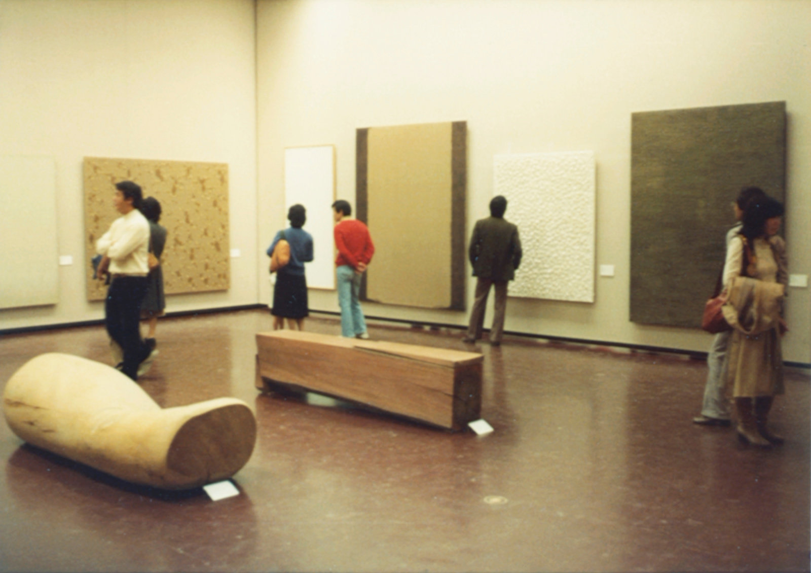

© Yun Hyong-keun Estate, courtesy of Yun Seong-ryeol, © Estate of Kwon Young-woo.
On Color in Contemporary Painting
Korean art today raises notable issues, especially in the field of painting. So far we in the Japanese art world have had contact with Korean art only through information and never had the occasion to have a substantial firsthand grasp of its trends. When artists participating in the exhibition Korea: Facet of Contemporary Art visited Japan, they were invited to engage in a direct exchange of opinions with some of Japan’s most representative artists today. Park Seobo, Shim Moon-seup, and Lee Ufan agreed to participate in the following roundtable.
Lee Ufan: I would like to interpret for Mr. Park and Mr. Shim, who will speak in Korean. I’m not exactly sure how we should proceed with the conversation, but personally I would rather discuss the state of color within the current horizon of contemporary art instead of comparing the issues in Japanese and Korean art. The reason is that when I saw works by many Korean artists at several exhibitions, including Korea: Facet of Contemporary Art [Tokyo Central Museum] and the shows of Kim Whanki [Tokyo Gallery], Shim Moon-seup, Lee Dong-youb, and six watercolor artists [Muramatsu Gallery], as well as of Kim Ku-lim [Kaneko Art Gallery], I was puzzled to see that almost all of them were in monochrome. One might say that this is simply a characteristic of contemporary art, but in this case the color seemed unusually restrained, and the overall impression was of an extremely inhibited world of painting. This gives rise to a number of interesting issues, such as the ideal of painting as an interdependence of materials and modes of expression; the characteristics of a painting surface when a base coat is omitted or, conversely, applied carefully; and the uniform, flat spatiality with a diminished form or image. For the moment, though, I would like to discuss how to think about color in contemporary painting, using the aforementioned exhibitions as examples. In this way, I would like to move beyond the comparative framework of Korea and Japan and broaden our scope to address questions that pertain to contemporary painting in general. I look forward to a candid exchange of opinions, illuminated by the participants’ individual views of painting and by their own personal experiences.
Suga Kishio: In the exhibition on Korean art, the use of black and white particularly stood out, and I can’t imagine what it would be like if the colors were changed to, say, red and blue. I felt that a sense of color with an urgent awareness of its limitations was at work.
Park Seobo: I think that the tendency towards the extreme limitation of color began with the Art Informel movement in the 1950s. Back then, I noticed that most people tended to use plain colors instead of colors that were mixed. Since then, it seems that the tendency to use color in an extremely limited way has continued to the present.
Lee: But there was a Korean exhibition at the National Museum of Modern Art in Tokyo in 1968 [Contemporary Korean Painting], and, as I recall, there were paintings with many colors. I also exhibited some of my works there, too. What do you think about that?
Park: Op art was quite popular at that time, so I suppose the selection committee just went along with the trends and chose works with a lot of color.
Hikosaka Naoyoshi: One question is whether the use or lack of color is a problem that is particular to Korea, or whether it is a problem related to the conditions of the current times. I had a small group exhibition in May [1977], and a young critic surprised me by making such a terribly primitive comment as “I thought that contemporary art ought not to have any color.” In Japan, too, there was a situation in which it wasn’t possible to use color. I wonder if that was just a superficial aspect of a temporary artistic trend…
Lee: Or a more fundamental issue…
Park: In Korea, when I think about it in light of what Mr. Hikosaka said, I don’t feel as though the rejection of color is a concern of contemporary art generally. I’m not sure if it’s coincidental or if it has something to do with ethnicity, but it’s a fact that the broad absence of color has robustly and stubbornly persisted for a long time and has spread without any critical activity supporting it. That’s why I feel that understanding it as one of the tendencies in contemporary art is slightly off the mark. But I’m not sure if describing it as an ethnic issue is accurate either.
Shim Moon-seup: Mr. Hikosaka mentioned that a critic said contemporary art ought not to have any color, and in some sense I think that has some truth to it. It seems like some kind of a joke, but then contemporary Korean art would be truly au courant. [Laughter] However, I don’t think we did it to be up to date. It was just the only possible outcome of various restrictions and conditions.
Suga: I often use the natural colors of stones and wood, but I have a feeling that in Japan such use of color is a reaction to the colors that were used for the extremely radical sculptural works produced in the late 1960s, around 1969 and 1970, such as primary structures and minimal sculpture. Of course it depends on individual artists, too, but artists who do not consciously use natural colors tend to believe that one can have a better command over the world without using colors. [Laughter]… It’s easy to buy into the illusion that doing so carries greater significance. But the world exists even where there is color. I think that the world can be captured independently of whether color is used or not.
Shim: I feel that if we start talking about color, we will run into a very difficult [situation]. The thing is, from ancient times Koreans have used brilliant colors in the designs of houses, as well as in temples and on clothing. There is a history of using brilliant colors in painting, too. Why doesn’t contemporary art have color, even though we have this history? I personally don’t understand. However, we should treat this issue as one of expression, which is to say one that applies to painting in general or to painting today. If we limit ourselves to the particularities of Korea and Japan, I think it will be hard for us to address topics like theories of painting or expression.
Takamatsu Jirō: I agree that there wouldn’t be much point in discussing the particularities of Japan and Korea. I went to Korea in 1973 with Mr. Lee and stayed in Seoul and Kyŏngju. During my sojourn, I got the impression that although there were countless billboards, as there are in Japan or New York, they were somewhat different. Perhaps because I can’t read Hangul, I had the illusion of being in a Paul Klee painting, but what was different from Klee was that the colors used were almost exclusively white, black, red, and blue. If you go to New York or Tokyo or even Europe, billboards are very colorful. They use different colors like green, beige, pink, purple, and neutral colors, but those I saw in Seoul were white, black, red, and blue. Is this actually the case?
Lee: I think that, first of all, there’s a question of climate. For example, it’s very humid in Japan. Because of that, the environment doesn’t reflect primary colors very strongly. On the other hand, it’s very dry and the air is extremely clean in Korea. Since the air is transparent, things have a crisp appearance. But for the same reason, it conversely becomes harder to recognize the particular presence, or the colors, of things. Optically, too, colors are highly differentiated and are in stark contrast from one another. For this reason, unlike in Japan, there is almost no subtlety, vagueness, or suggestion. Second, there’s a question of history and circumstances. Historically speaking, the low regard for color within Confucianism has had an influence, and it also affects the circumstances. I don’t think that the poverty of society has had anything to do with the simplicity of expression. Rather, I feel as though in the fifties and sixties, people used extravagant colors more. Recently, life [in Korea] has gotten much better, but expression has become simpler. In terms of the general situation, color is far more abundant than before. With many goods being produced and society prospering, there has been an inundation of color. And yet, in the realm of artistic expression, it seems that the tendency to ignore color has gotten stronger.

Takamatsu: I see. I thought that maybe commercial communication in Korea required more finesse, but I digress. This has nothing to do with the exhibitions on contemporary Korean art. I can’t fully dismiss the remark by the young critic who thought that contemporary art ought not to have color. Particularly postwar art.
Hikosaka: I’d say it’s even more recent, especially from around 1970 onwards.… Mr. Suga mentioned minimal art and primary structures earlier, and I believe that the process of abstraction of color itself, which became an issue in the early twentieth century, reached an apex there. Abstraction could also be understood as color becoming extremely autonomous.… So you could say it has become difficult to use color after that…
Takamatsu: Personally, I think that the use of color has been avoided for the past five or ten years because it was used up in that period. The early twentieth century was particularly analytical. A typically European positivistic methodology was adopted whereby entities were broken down into different elements such as form, color, material, and space, only to be reintegrated. This wasn’t restricted to Cubism by any means. Color and form were seen as mere attributes of a thing’s existence. And above such attributes lies the problem of the thing’s thingness, which exists side by side with the question of space. I’m not sure whether it’s due to this kind of methodology reaching an impasse, or it’s simply the case that a more constructive approach to making things was assumed, but when you start to think about the existence of things in a more comprehensive manner, treating color on its own, or form on its own, becomes somewhat unsuitable. This is something that my own work has led me to think about, and I’ll leave it to critics to think about whether such a trend, objectively speaking, does exist, but I have a feeling that it does. In other words, being strongly conscious of only one attribute leads to the loss of the totality of existence.
Park: What Mr. Takamatsu said is very interesting, and I agree with it. To look at it from a different angle, let’s think about calligraphy. There is calligraphy in Korea, too, but if calligraphy were written in all sorts of different colors, I don't think I could handle it. Calligraphy can probably express the world in its entirety without using colors because of its materiality and spirituality. It can express the whole with just one color, and that’s how it made possible such a holistic monochrome with the use of ink alone.
Suga: I want to regard color naturalistically, as a landscape. Color was profusely employed in the sixties, and because everything became commercial based, color flooded the world in general. At the level of culture, too, color was in a state of saturation. But artists are always at the forefront of aesthetics regardless of whether they work with color or with things. So when they were deprived of the primordial purity of color, what came out was a different world, a world of the natural environment and landscapes that existed in the artists’ memories. And this other world happened to have no color. It only had natural colors. I believe that it’s such color that allows us to look at nature totally while at the same time making [nature] homogeneous.
Takamatsu: Another point is that when discussing color, just like we are doing now, we tend to discuss coloring and not color. Even when we say that, for example, Mr. Shim’s paintings have no color, the beige of the canvas inexorably exists. Many works use a piece of cloth, but it also applies to, say, the rocks used by Quac Insik: even though they may not be painted, they have colors all the same, whether it be gray or brownish red. What becomes problematic when discussing coloring, or regarding color as a problem of coloring, is the issue of artificiality. In most cases, people talk about color when what they really are referring to is artificial coloring. And it has recently become a focus of discussion to rethink what this artificiality means.
Lee: Indeed. The distinction between coloring and color is a very interesting issue, I think. The word artificial stands between them, but I think that the problem of color itself is always part of people’s awareness when discussing coloring.
Hikosaka: Mineral pigments and dyes, too, were originally extracted from natural objects. I should also point out that an artwork is, after all, an artificial or cultural artifact. Yes, coloring is certainly artificial, but it’s something that has been done over millennia. I have worked for a year as a yuzen artisan dyeing kimonos, and I know that even if you used the same dye, the final color that is produced is completely different according to the fabric’s quality, weight, the fineness of the weaving, or even just the dye pattern. So you always have to dye a strip of cloth and dry it to see what kind of color will actually be produced. And even then, you’d have to steam the cloth to fix the dye and then wash it, so the exact final color is always unpredictable. I learned firsthand that the same dye produces such different colors due to delicate differences in the textiles. Coloring is heavily related to the material, so I think that color can never be an abstract and autonomous thing as we see in color sample books. Coloring only becomes visible to the human eye as color through the contradiction between the color and the material, so it shouldn’t be thought of in the same way as those old artificially colored photographs. The coloring in artificially colored photographs is much more reproducible.
Park: I completely understand what Mr. Hikosaka said just now. Mr. Takamatsu made the distinction between artificial coloring and colors, and I get the feeling that when we think of color in relation to images, we tend to immediately connect it to artificial coloring. That reminds me of two elements in Korea that I feel contributed to artists removing color. Societally, color has become more abundant. Nevertheless, artists have started to limit their use of color. One reason is that the images are fragile in Korea to begin with. Koreans react very poorly to images. Second, the more colors appeared on different products, the more artists used their wisdom of foresight or consciousness to stay one step ahead, to consider what will come of all of this. This prompted a reaction to reflect on the view of nature and the general disposition in Korea. To blindly follow color is to pursue the image, and that’s unbearable. It’s frightening and unbearable. That’s why I feel artists began to attempt to recover totality, causing color to disappear.
Takamatsu: I can personally fully agree with the recovery of totality, but when it comes to the question of image and color, I feel it can be dangerous to lose sight of the complexities. The issue of the image is one that has to be considered on many different levels. The simplest example is that when you apply paints onto a flat surface known as a canvas, it may look like a mountain or a building, or if you paint the upper area in blue, it may look like the sky. I’m not sure if I can call this simple, but the point is that images exist in pictorial spaces that are more abstract than such figurative images. At the same time, however, it’s also possible to adopt a different standpoint and to argue that abstract paintings don’t have any imagery. Like with Matisse’s paintings, for example. And color, too, can be used as a means of negating the image even when employing strong colors, as in the works of Barnett Newman and Frank Stella. I just wanted to point out that if we start dealing with the question of the image, things become extremely complex.
Park: I also think that there is that side, too, of course.

Lee: I would like to say something, too; it’s boring just being the interpreter. [Laughter] Of course I agree with Mr. Takamatsu, but I always hear the word analytic from the French and especially the Americans where logical positivism is very strong. After Cubism, I think, there was a concern for synthesis behind the emphasis on the analytical. This seems to me to be a self-contradiction. Cubism had a certain inevitability, and as an attempt of course it was very meaningful, but the reason I think it failed is because it never went beyond the analysis and the synthesis directed at objects. That is, it was a way to think about entities. Due to these limitations, however much one might analyze or synthesize, it is impossible to overcome the limits of a representationalism that questions the object always in relation to images or to possession. It is more like a coagulation of images than a fact. It is limited to aspects like form or color with which an object is inevitably associated. And so when it comes to totality, there emerges a desire to go far beyond it, to a more holistic world. It’s quite vague; some might call it existence, others call it the world. I don’t know how to put it, but it seems there’s a growing interest in the situation or the world of which the object is a part.
Shim: It may well be the case that, as Mr. Takamatsu said, cloth has a cloth color. Yet, that is different from the kind of coloring that may be referred to as coloring-ism. I believe it still exists. We were just talking about the group Supports/Surfaces in France, who daub cloth with color, while discussing Cézanne. I’m thinking of people like Claude Viallat, Louis Cane, and Marc Devade. It would appear that their motive is to treat color like a material object. But in trying to overcome color, they’re instead immobilized by it. In comparison, if I were to regard my works as possessing color, perhaps what I try to do when I sand my works is to make the color of cloth more and more into the color of cloth. In that sense, what I do is a bit different from trying to save color from the image by slapping it onto the canvas.
Takamatsu: Of course it’s different. That’s why I tried to differentiate between the colors of coloring-ism and other colors. What I wanted to say is that in terms of the general or logical meaning of the word color, both are colors, but where that of Louis Cane is the color of coloring-ism, the other is color as but a single attribute of an entity…
Shim: When I went to the Paris Biennale in 1971, I couldn’t make sense of Supports/Surfaces. It just looked like the work of some strange dye shop or fabric store. After that, I went to the Paris Biennale in 1973 and 1975 and saw them there again, and I was surprised that they were still doing it. Then some Japanese person whose name I forgot told me that what I do is more advanced than that of those drapers. After that, a person who owns a gallery in Paris and represented one of the drapers came to me and told me that what I’m doing was exactly the same as what [the drapers] were trying to do. I couldn’t stand the fact that they were trying to view what I do according to their own contexts. As Mr. Takamatsu said, what I’m attempting to do is to understand color or action as attributes of an entity in the world. What they do is interpret fabrics and colors as material objects and administer coloring within the relationship between different materials. This is different from what I do, even though there may be some similarities. I also think that their work has likely reached its end by now. I hear that coloring-ism is now faced with many contradictions, and if they tried to deal with issues like synthesis and totality, I think they will necessarily arrive at a similar way of thinking as myself.
Suga: This may not necessarily relate to the difference between color and coloring, and it may just be my personal thinking, but I’d like to focus on the image first. I don’t like the word image in the first place, but what I felt looking at the exhibition was that there was something like color but not image. I’m more interested in the fact [jijitsu] that there is color. Perhaps the word fact now includes what is called the image, and has taken a different shape and meaning. Being able to capture the fact is, for me, to have the power to grasp color, form, and all the other qualitative and quantitative factors together as an inseparable single world. We are, in other words, pursuing the fact. A fact may be an ordinary thing that doesn’t deserve attention, but it interests us. What is still unresolved for me is whether it is that world that calls forth color, or whether it is color that, when applied, pulls a different fact into it.
Takamatsu: Maybe we can put it this way: if color and form are only attributes of a specific entity, then the image is nothing but an attribute of the relationship between the entity and humans, and the fact includes all such attributes.
Lee: I’m starting to understand it.
Suga: The works of Mr. Park and Mr. Kim Ku-lim do present some color, but it’s hard to imagine that those colors emerged from images. A possible interpretation is that, in relation to the space, they function as a—
Lee: Like a sign…
Suga: When I say “sign,” I use the word to mean something like dimension. Colors as in pigments that have a certain thickness to them…
Hikosaka: We’re limiting the discussion of color to its relationship to imagery, but if we were to understand that color has reached an apex of abstract autonomy in the period during minimal art and primary structures, as mentioned earlier, then I feel that color has moved closer to language. To me, it looks as though the color red can be equated with the language of red. If we look at the properties of the pigments used in minimal art, they tend to have strong coating abilities that hide what’s underneath with their opaqueness. It’s a culmination of the opaque painting technique [that appeared] from about Monet onwards. On the other hand, the colors that were at the extreme opposite in the same period were the luminous colors of color television. This might be an exaggeration, but it’s only been less than twenty years or so in human history that we began to perceive luminous colors in such large quantities. After all, we used to perceive many things through reflected lights. They’re opposites, but at the same time they possess the same level of abstractness. And due to the pressure from those two polarities, it became impossible to use any color apart from natural colors. I also feel that up to now, we have never talked about the color of Mono-ha works per se. I use color, and the negative reason that I have come to use color is that I felt that natural color was starting to become too binding. When the notion that “it is possible to have greater dominance over the world without color” becomes too self-evident, then conversely there is a danger that the totality could be lost. For me, color exists as an important method to go beyond Mono-ha and post–Mono-ha flatness from within [those works]. That doesn’t mean we should go back to old colors. We should attempt to find ways to go beyond the reductionism implied by the three primary colors, by black and white used in the early twentieth century, or by monochromism and the colors of Minimalism. I personally found a clue in the relationship between a transparent painting method and the material, or rather the contradictions between them, so I attempt to actively restore the kind of representation generated by such contradictions.
Suga: In the catalog for Korea: Facet of Contemporary Art, I saw this work by Mr. Shim. Here the canvas seems to represent a space, and it has been sanded so that the frame comes to the fore. I believe that this was done to create a partition—something like a partition in space that can be perceived as due not to color per se but to a change in color. His works don’t actually need color. Color is used almost as a tool, as a way to differentiate not so much planes but spaces. Therefore the issue is not planar space but the entire entity that possesses a space. Different strata of colors are partitioned, just like the space at the back is presented in the front. This is how I saw Mr. Shim’s work.
Shim: Certainly at first, while I was stretching the cloth to the frame and rubbing it down, I did it with concern for the partitioning of the frame below and its condition. But as I was doing it, I gradually became aware of its limitations. I started to think that there might be something bigger behind the action of rubbing, or in the relationship between different materials, that was visible yet invisible. In other words, I merely made use of the rubbing and partitioning as a means to express those deeper things. They are signs. Because of this, the partitioning that comes to the fore doesn’t exactly follow the frame behind the canvas and slightly deviates [from it]. At first I was interested in the relationship between matter and time. That was my starting point. But if I limit myself to a concept like that, I would end up doing something similar to what’s in vogue in Europe now, whereby in relation to the problem of flatness, they use a piece of cloth to criticize the kind of spatial theory emphasizing the relationship between time and matter. I feel that what lies at a deeper level is different from this.

Suga: From the point of view of [the critic] Michitaro Tada’s “culture of gestures,” I would personally start by questioning whether to use a canvas at all, so I was surprised by the fact that Mr. Shim chose to use a canvas. The canvas disappears when you sand it. It becomes worn out. I couldn’t immediately point out whether you were intending to wear it out or you were adopting a gesture to emphasize the whole.
Shim: Indeed, as Mr. Suga said, at first I used sandpaper to file [the canvas] as much as I could until it got worn out. The result hit me with a certain vigor and I was interested. But one day I looked at it, and what I saw was not the whole but the material or the act close-up. That’s not what I wanted to achieve, so I began to avoid putting more actions into the canvas, and instead chose to contain myself and restrict the actions. I understood that I could allow the bigger things to come into view by limiting myself.
Suga: I completely agree with that.
Takamatsu: This might be a new theory of the image. I feel the same can actually be found in more traditional forms of art like broken-ink paintings, too. The less there is, the bigger the prey.
Suga: Yes, that’s exactly it. There’s a dance called jiuta-mai, which focuses on expressing more by dancing as little as possible. The same kind of thinking exists in Japan, too.
Takamatsu: The reason I say it’s a theory of the image is because you can’t reach out to the bigger things without the mediation of the imagination.
Lee: When I think about why I make things and why I write, I can manage a number of strained responses, but ultimately the reason is strongly ethical in my case. Expression, if simply left to itself, may of course attain universality. But to place even a single stone or to draw even a single point, I feel that there must be a very strong sense of individuality intertwined with corporeality and morality. Up until now, those issues have been limited to the realm of methodology, but I feel there should be a question of training, practice, or even religion, although that would be pushing it way too far. Of course, any form of expression can’t be simply ethical without being backed by a thorough logic. That would just be nonsensical. As a result, regardless of whether something is global, Japanese, Korean, or even universal, artists need to attempt to express things from a different context that is more connected to real lives in order to produce a new and open concept of culture. I feel this in my work.
Suga: What I strongly felt, looking at the exhibition, was that it presented a flatness that fundamentally differed in concept from [the flatness] of America and Europe. It’s a different flatness from what we’ve seen until now, so talking about flatness itself would probably be missing the point. To begin with, the works of Mr. Shim and Mr. Choi [Byung-so] do not deal with the concept of flatness but rather with the flux that occurs above the level of the material fact. In other words, I felt that one should try to limit the viewpoint with regard to why such flatness should be apprehended, before meddling with issues of flatness. To be honest, I feel a little stuck, as I can clearly put a finger on the difference between the Japanese and Korean concepts of flatness. For example, [the prominent ink and wash painter Toyō] Sesshū went to China to study its painterly techniques, but after returning to Japan, he renounced everything he learned because it didn’t suit the Japanese landscape, and instead he revisited the teachings of his Japanese master in order to acquire a new painting method. I feel there must be that kind of methodology that can’t be separated from the native cultural climate. And it just so happens that I couldn’t help but feel something like it in the works of the Korean artists that I saw.
Lee: Before I interpret for Mr. Shim, I want to mention one thing, and this relates to both the approval and the misunderstanding I have received in Japan. This is something I realized afterward, but it’s a problem of choosing words and concepts. When I use words like natural, as it is, or representation, some people swallow them directly, while others soundly criticize them. But what needs to happen is an analysis of the context in which those words are used. On the other hand, I should have been more careful about when to use words like nature in Japan. I became keenly aware that if I used the word as if I was using it in Korea, it could sound absurd in Japanese.
Shim: Mr. Suga mentioned the word flatness, and it’s a very difficult word. There might be a difference between the flatness I think of within the situation in Korea now, and how Japanese people think about it. For example, young people in Korea use the word event. Mr. Suga has an event tomorrow and I plan to go, but my concept of “event” might be a little different. I’m always aware of such limitations of words, and I feel compelled to create new words with new conditions. Many words like color (iro 色), color (shikisai 色彩), or act (kōi 行為) are still used in the translation of enlightening Western words in both Japan and Korea. But the people in the West who created those words have started to doubt them. Perhaps the time has come for critics and artists to create new words.
Suga: I do in fact use the word event, but I’m skeptical about the concept of the event itself, so I’m entirely uncertain whether its contents will fall into the category of art or whether it will be understood by other artists. I just happen to be doing an exhibition in a certain gallery, and a space that contains such time is extremely original. The people who can understand that particular originality will gather there, and those who don’t won’t get it at all. There’s nothing that can be done about that. This is just inevitable from the standpoint of the person who makes the exhibition.
Lee: I think this is something that Mr. Hikosaka has pointed out in the past, and I also felt it keenly when writing about Mr. Takamatsu’s works. That is, in Europe they say Art Informel, and in America they say action painting. Yet, when a similar movement occurred in Japan, the Japanese critics didn’t give much thought to exactly what they should call it. Perhaps the same could be said for Korea. There have been many movements in Japan, such as Gutai and Neo-Dada, but almost no one thought about what concepts should be used to explain them. I feel as though there is something missing in terms of how we acknowledge our actions and existence. This may be one of the reasons why Japanese art tends to be at the mercy of global trends, except for those artists with a strong sense of self-assertion. I truly believe that linguistic precision is now required to go beyond the division between East and West and understand and conceptualize our own activities, as well as to define a tangible position and attitude for ourselves. This is especially the task of critics, and such efforts will allow our activities to have a public purpose and reveal the genuine essence of the particularities of a region and its circumstances.
Takamatsu: But I also feel that artists can’t follow everything that they do with words.
Lee: It’s not that artists have to do it. It’s an issue of the culture as a whole. Adopting Western language alone will not suffice; the raison d’être of expressive activities will continue to be diluted. There is much more to discuss, I’m sure, but I think we’d better stop here.